
AMOR/Starbucks Packaging
This packaging design is for a new, Starbucks line of hot-chocolate: Amor.
Demonstrated here is the conception and creation of a standard box packaging design for Amor Hot Chocolate, a new line of high end hot chocolate made by Starbucks being targeted towards young working professionals between the ages of 20-35.
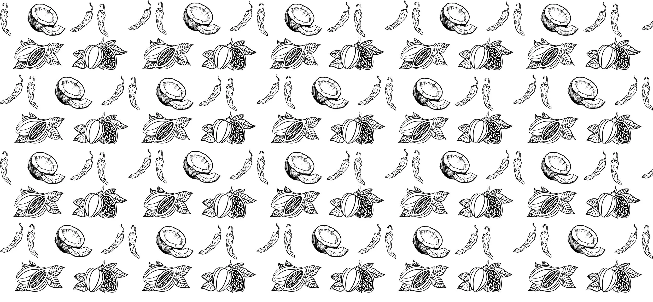
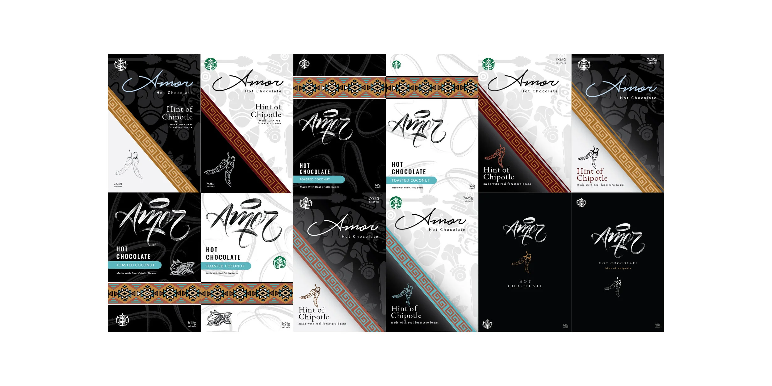
Two distinct flavour packages were designed for Hint of Chipotle and Toasted Coconut. Each package features design elements focussing on a single cocoa bean unique to that flavour. The Forastero bean is seen in the elements of Hint of Chipotle while the Criollo bean is featured in the Toasted Coconut design.


Taking inspiration from the Spanish word Amor, and the Central American sourcing of the cocoa beans, one can see the influence of Mesoamerican culture in the initial sketches with reference to the rainforests, and more current design trends found in Central America.
Both the Criollo and Forastero beans are illustrated with the Criollo bean having a longer thinner look than the Forastero. Chipotle peppers and coconut illustrations create additional visual and identifying elements on the packaging.
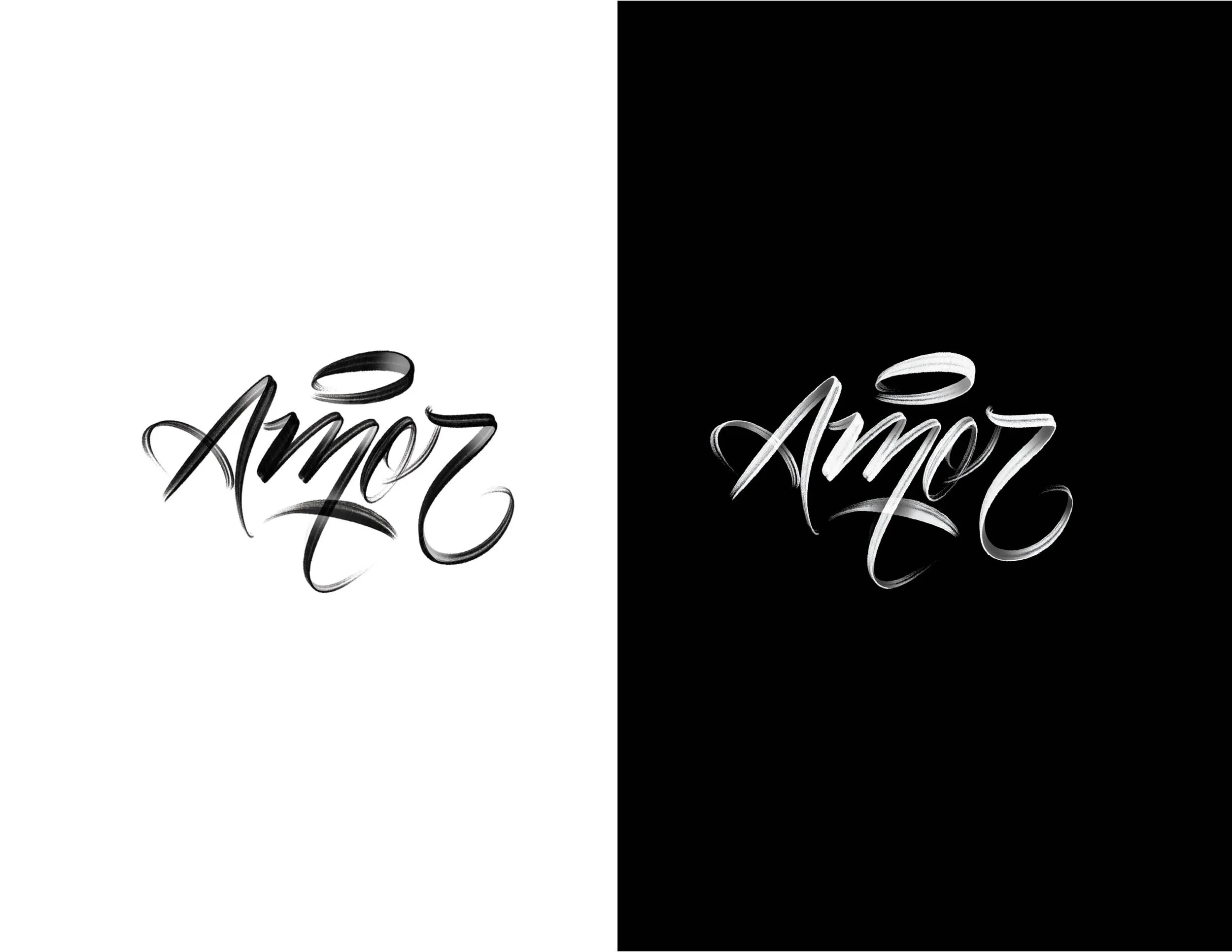
A custom, hand drawn type is created to be the focal point of the packaging. Shadows are used to give the type piece depth and to allow the package to ‘pop’.
First Iterations
The first 10 designs focus on using elements of historical, Mesoamerican culture. Textile patterns, colours and ideograms from Aztec & Mayan cultures are used to compliment the illustrations and custom type pieces.
Each design looked at both a light and dark option. In the end, all 10 were dismissed as either too busy or, like the two in the bottom right, too minimal.
Second Iterations
The second iteration sought a better balance between the illustrations, patterns, title type and information. Background textures were removed and less intrusive textile patterns were employed. Information hierarchy was adjusted to determine better possibilities with the increased space.

Final Designs
Final patterns are determined for each distinctive flavour as well as the clearest and most impactful type hierarchy. Subtle additions were made such as the implementation of colour within the type as well as illustrations of the coconut and chipotles for each flavour.


Full Packaging Template
The sides of the package hold both the Starbucks and AMOR main logos, as well as an enlarged version of the package’s flavour illustration for recognition when the packaging is stored on shelving. On the back of each package is an illustration and brief paragraph detailing the cocoa bean used.