

Sharpie Package Design
This packaging design is a revitalization of the original Sharpie package. Original colours and information were used to help consumer recognition while creating a new, more attractive design. The current, official Sharpie packaging can be seen to the right.

By designing a more consistent stroke width throughout the word and by sharpening end points while adjusting letter spacing, the wordmark takes on a contemporary look.
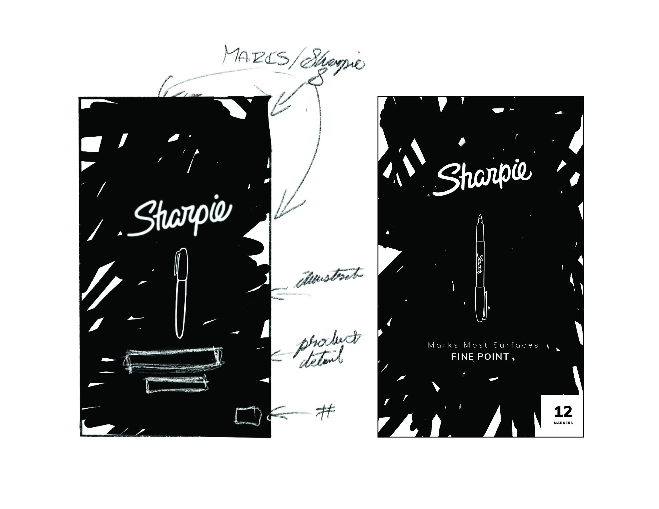
Below are the first 4 concepts as sketches with their first graphic renditions.
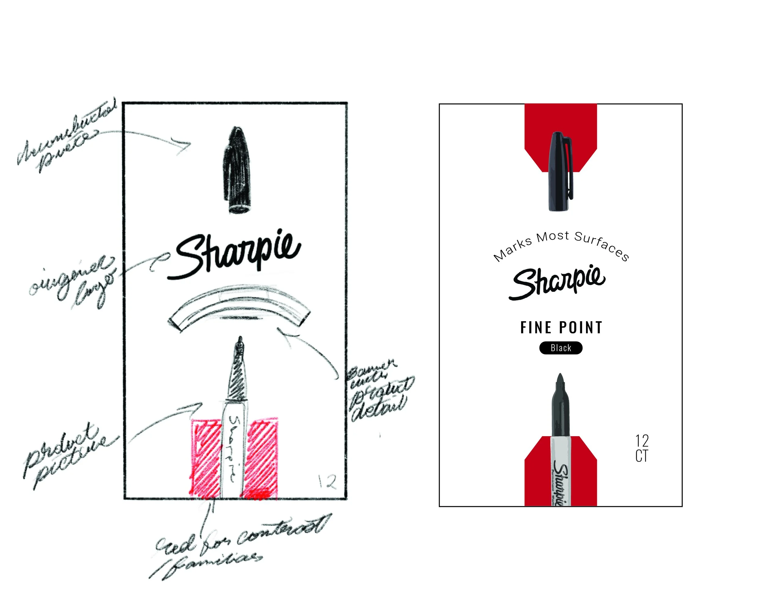


Concept One
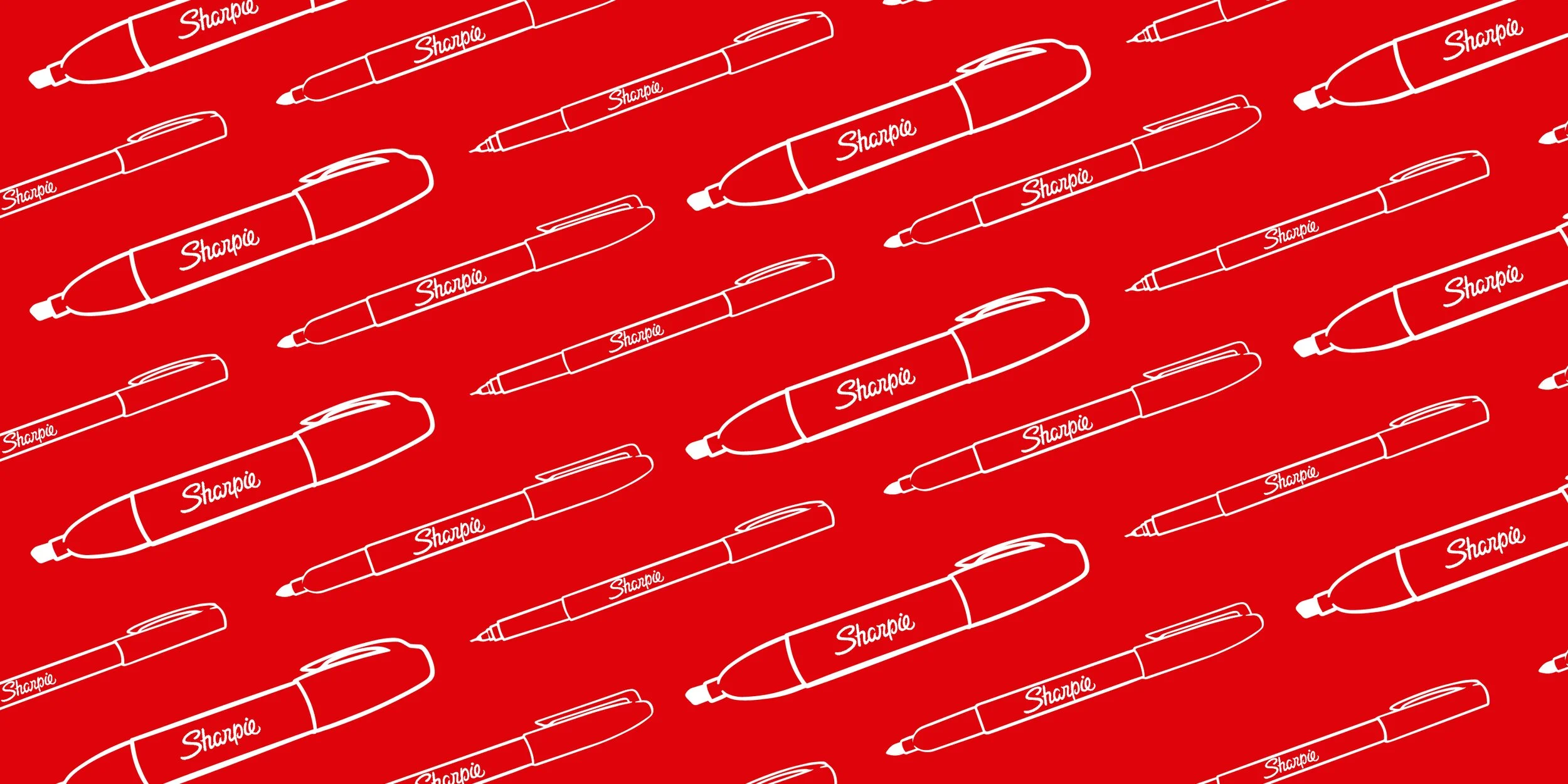
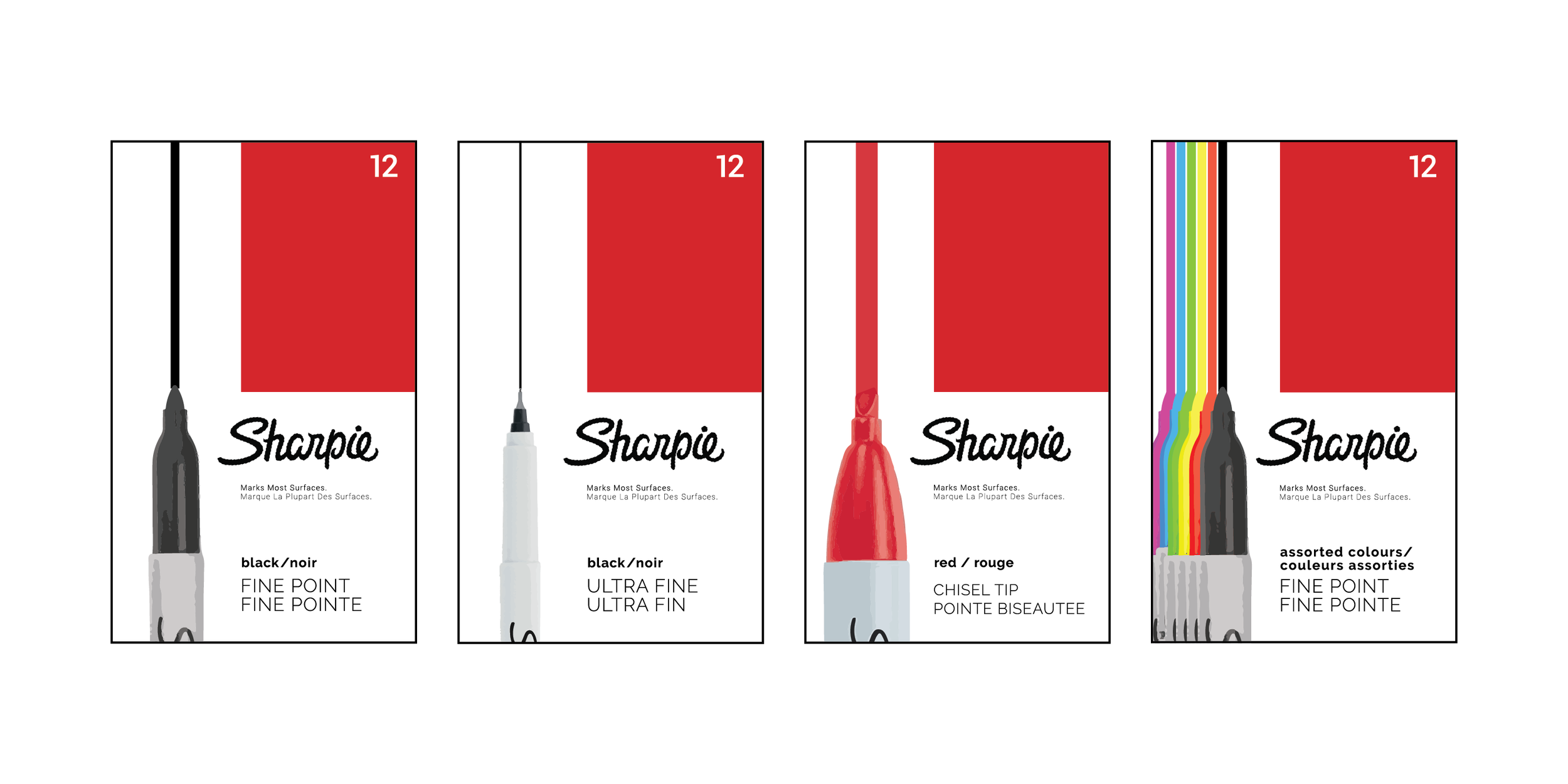
This concept uses the graphic image as the focal point. Notice the scale rendering of the style and colour of the marker within.
The line depicts a general width of what the marker produces.
This design contains the main elements of the original packaging while emphasising clearer type hierarchy for better communication.
For reference purposes, this concept is tested across the fine point, ultra fine and chisel tip.


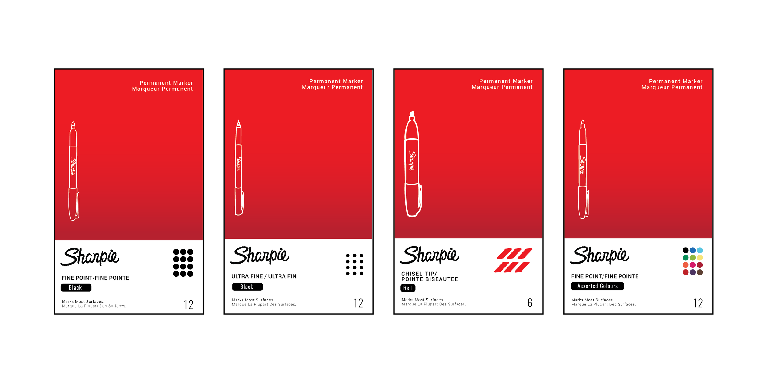
Concept 2
This concept employs the same main colours and gradients used in the original Sharpie packaging. Notice the use of the bottom, white area for the crucial distinguishing information of type, colour & numbers as well as the updated Sharpie wordmark.
Illustrations of distinctive Sharpie styles are used as additional recognition points on the face panel.
For the benefit of the consumer, the bottom corner now contains the graphic depicting the shape & size, number and colour of the markers included.